Hi, my name is Amy Chiang.
A senior product designer who loves transforming data into a service that touches human life and emotions.
I am currently reshaping the future of cross-border payments at Ripple, making global transactions smoother with crypto technology.
Design Process & Philosophy
Ask questions
What’s the core problem exactly? Low ego. Don’t assume. Early in my career, I had insecurity about asking “dumb” questions but I found out all those questions helped connect the dots, hence unlocking more possibilities.
Design, Validate, Iterate
No projects are the same. Though design thinking, design sprint, user research are commonly practiced, I believe human collaboration and user empathy are more than framework templates.
Collaboration
“We rise by lifting each other” It might sound cliché but over the years I learned that everyone has their own superpower. The best way to succeed in any project is to give room for every individual to shine.
Retrospective & Follow up
Success and failure are both relative and temporary terms in my opinion. Project iterations will never end. I like to think of it as “What did I/ we learn?” and “What should I/ we continually doing or not doing in the following projects?”
Lookout Cybersecurity
2016-2022
Dashboard redesign: Value-driven dashboard from day one
Strategy | Product Design | B2B SaaS platform | Research
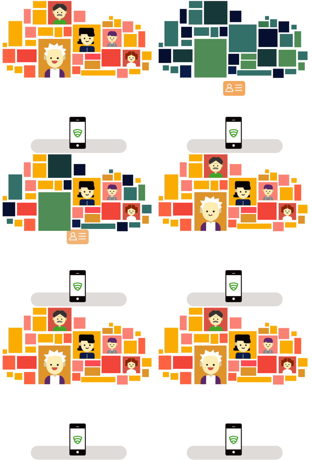
Lookout Mobile Endpoint Security Platform offers the most comprehensive digital security to thousands of businesses with a privacy-focused approach so their employees can focus on accomplishing their goals without worrying about ever-changing cybercrimes or phishing attacks.
The old dashboard did a poor job of showing valuable information and capabilities, which hurt the business matrix. As part of this project, I facilitated cross-functional teams to dissect the problems and come up with possible solutions using design and research exercises. The new dashboard redesign resulted in increasing the enrollment rate by 80% in the first three months.
Threat hunting console redesign that allows researchers to investigate and cross-examine suspicious activity and data
Strategy | Product Design | B2B SaaS platform | Research
Mobile Endpoint Detection and Response (aka mEDR) redesign is the official name of this product. It's a very challenging and exciting project because it turns an internal secret weapon into a public offering and helps businesses to use the same tools Lookout's threat intelligence team has been using for years.
Technical platforms like this are for power users who are trained professionally to dig into the nitty-gritty data and look into suspicious unusual patterns. The assessment process/flow can be cross-page if not cross-resource, so all data tend to lead to another data exploration. I conducted the research myself in Toronto Canada and led the design to finish. I am completely thrilled to see it available at GA, given the complexity of the data and the scope of the product.
Coming soon
Continuous Conditional Access: Ensuring only safe devices access corporate data in the remote workspace
Strategy | B2B SaaS platform | Research
During this project, I led the design and strategized the end-to-end experience with the PM and engineering teams. This project actually requires very few UI designs due to the goal of providing seamless data access for employees. The challenge was to learn the technology behind the "continuous contextual" approach and guide the admins through the setup between integrations. This video shows an end-to-end demonstration by Sneha Sachidananda, the principal PM.
Sneha Sachidananda
“Amy and I collaborated on many projects at Lookout. She was the lead designer for the project Continuous Conditional Access. It was a fairly complex technical project involving multiple components and stakeholders, which were both internal and external to Lookout. She understood the problem we were trying to solve and came up with a simple and intuitive design satisfying the use cases while focusing on the user. She participated in discussions with engineering stakeholders, also collaborated directly with the team at Google to build a joint solution for our customers.”
Integration center
Product Design | B2B SaaS platform | Research
With the goal of providing seamless, automated, and comprehensive security solutions, Lookout continually expands its partnerships with reputable companies like Google, Salesforce, MobileIron, etc. The configuration process and the renewal period may vary from platform to platform. As a senior product designer, I led the design and worked closely with product management, engineering, and customer service to ensure the set-up process and continuous status checking were simple to follow.
Lookout Android app redesign
Product Design | Visual Design | B2C | Android app
During my first year at Lookout, I had the opportunity to work with a variety of talented senior designers and product leaders to redefine Lookout's most classic and popular product. In this project, I'm responsible for visual directions, mobile threat education, and design system. As a result of the redesign, the app was downloaded by 1.1 million users and reviewed with 4.6 stars.
Day of Shecurity
2017-2022
The conference aims to increase gender diversity and recruit more female cybersecurity professionals
Culture | Event experience design | Branding | Community building
Lack of gender diversity in cybersecurity is a known problem. My coworkers and I wanted to do something concrete and active that would get more women into the field. In June 2017, we organized our first 20-person event in Lookout's SF office, which went very well. The next year, we hosted another Day of Shecurity with 250+ registrations and 100+ additional waitlist attendees. Over the years, with the help of many more teams and people, the event has scaled up by 55 times and it has touched the lives of thousands internationally.
As the designer director on the core hosting team, I helped curate the brand, swags, and in-person conference experience in San Francisco, Boston, and Toronto.
Yeti
2015-2016
Tape - The smartest, simplest way to create engaging videos with friends
Branding | Consumer | iOS App Design
I helped define the visual design direction and formulated the design system, including icons, color palettes, and design components. The outcome of the app was significant even though I was only involved later in the design process. Within a week, the app acquired over 20,000 users and was featured in the Apple App Store as a Best New App.
Image from Yeti.co project website
Emot
2014-2015
Early emotional intelligence education for toddlers
Strategy | Product design | Consumer | Research | App Development
The ability to handle emotions is among the top skills humans should have, especially in children. The purpose of this game is to cultivate kids' empathy and explore their own facial expressions. Children learn how to put themselves in other people's shoes by taking photos and observing their own emotions and expressions in various scenarios.


