

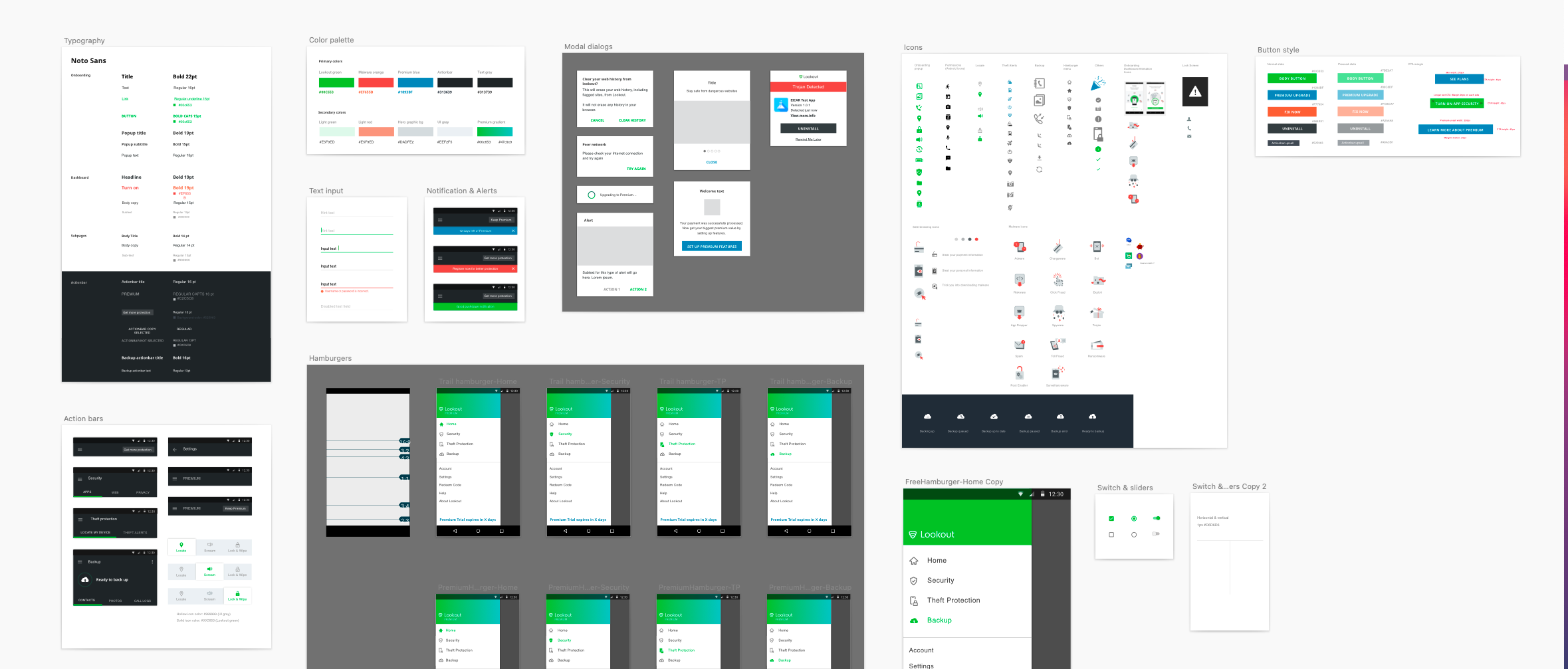
Lookout Android app redesign
Product Design | Visual design | B2C | Android app
Redesign the old Lookout personal app into a modern/fresh version that clearly communicates the feature values
Company
Lookout - Consumer team
Year
2016-2017
Role
Product Designer
The team of 1 Product Managers, 2 Researcher, 3 Product designers, 2 Marketing designer, 3 Developers
Problem
An update to the old Android design is required from both the perspective of customer experience and business objectives. Common issues after getting feedback from the users:
Don’t know what to do when they get into the app
Don’t understand the features and scared of trying premium features
Don’t know what are features are free versus premium
Don’t know what the app can do exactly


Goal
Business goals
Increase number of active users
Increase conversion to paid tiers
Simplify value prop to our consumers and carrier partners
Design goals
Prioritize information and functionality
Clear and straightforward
Build an emotional connection
Express Lookout personality
Approach
The project already had many senior designers and leads working on it when I joined the team. I was given the responsibility of exploring visual direction, user testing, and design system. We assigned designers to work on different areas of the design so that we could work together in parallel. Weekly, the design team members met with broader stakeholders, such as personal PMs, product leads, engineers, and marketers, to ensure the product design is scalable, usable, and appealing. Our design feedback process was structured and candid, like this article “Guidelines for constructive and empowering design feedback and critique”.
Target users
Primary: New and existing Lookout android users
Secondary: Consider IOS platform users for future rollout of design system
Design process
Notes from the workshop on the project principles and the north star
Exploring different interaction dashboards to maximize feature discovery

Android App competitor analysis. Specific data was cropped out for confidentiality reasons

Concepts for rich data visualization and mechanic illustration

Playing around the header image with different feature structures.

Hypothesis: bucket features by categories and use the visual story to help users quickly identify the tool they need.


Dark theme visual exploration by team designer

Status explorations

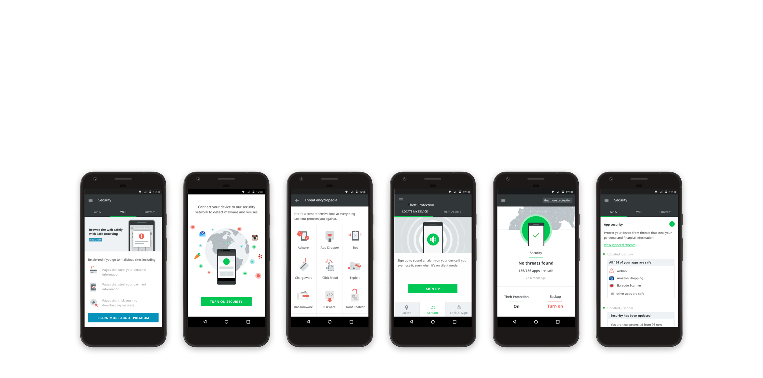
Threat encyclopedia for mobile devices
In our user feedback, we regularly receive feedback such as "I don't know what threats are out there", "What does X mean?" and "Why is it important to protect X data?", so we decided to add an educational page that allows users to learn whenever they encounter mobile threats.
I worked with the research team to document threat classifications and use visual language to explain the threat without long text.
Download the final redesigned app here

Outcomes
THE WINS
Everything from the information infrastructure to the visual design to the content strategy was completely updated and redesigned. Together with engineers, we also create a design system that can be easily applied to iOS apps. Downloads have consistently increased by 5% over the first six months. Today, it has been downloaded by more than 1.1 million users and has 4.6 stars in the Google Play store.
Several app rating websites have listed "ease of use" as another advantage of the app.
THE LOSSES
The project had such a large scope. The company decided not to build the iOS app after we completed the Android redesign project and to use the product resource in other projects instead. This decision has resulted in Lookout's iOS and Android apps having inconsistent UX/UI today.
Lessons Learned
Content always comes first when creating a design. Determine what tasks need to be done and what points need to be covered so that the rest of the elements can contribute to the core content
By working side-by-side with engineers, I can save a lot of prototyping, animation, and interaction design time. There are many plugins and animation resources that can be modified via code. Brainstorming ideas with frontend engineers was really effective and fun.