
Dashboard that delivers value on the Day 1
Strategy | B2B SaaS platform | Research
Created an enterprise security dashboard that could not only show the health of an enterprise's security environment, but also motivate the customers to deploy and onboard their employees with confidence.
Company
Lookout - Enterprise team
Year
2019
Role
Product designer lead, researcher, workshop coordinator
The team of 2 Product Managers, 1 Researcher, 2 Product designers, 1 Developers, 2 Data analysis
Problem
The console dashboard is the first interface the user sees when they log in. Customer's expect to see the magic of the sales pitch and decide whether this tool deserves to remain in their security ecosystem at renewal time.
According to the Lookout data team, enterprise customers took approximately 3 months to fully deploy and onboard their employees, which translates to long product delivery times.
Retention and renewal rates were hurt by a low deployment rate and lack of value in the early stages.
Incidence-based dashboard design
Goal
The goals were to
Increase the product feature value recognition
Drive urgency to shorten the empty phase of the early product lifecycle
Increase the enrollment rate
Expectations from the leadership team
Streamlined experience from the early sales pitch to product onboarding
Easy enrollment so less customer hand-holding
Show the power of our dataset… “tell that bold story”
Constraints
High impact project so we have many stakeholders involved in this project
No engineering bandwidth for data dashboard layout customizable
Target users - IT & the chief information security officer (purchaser of security tools) - are difficult to reach for feedback
Lots of back and forth discussing, prioritization, and documentation about what data is helpful to show vs. what data can be showed accurately (data cleanup).
Research & Design Strategy
The project was kicked off with a lot of internal feedback and hypothesis. To bring everyone on the same page, we began with team knowledge sharing. During this process, we wrote down what we had learned so far and organized all the questions into categories.
Having high-level knowledge from different perspectives in the team was great, but we needed a more holistic journey map to empathize with the user. We roughly follow the double diamond design process in the project and here is the plan for uncovering the pain points and designing solutions.
A sneak peek into how we plan, interview, and sort information for the project
Results of the research
The 👍🏻 and 👎🏻 of customers’ journey revealed
The end-to-end experience map was the result of several rounds of qualitative internal and external feedback sessions. It tells the story from when they first contact Lookout until they are fully onboard with the product.
The experience reflects on sales' funnel drop-off data
This data comes from our internal sales and data team. Although it appears shocking at first glance, it actually confirms what we found in the customer journey map.
Proposed new journey
User experience design begins the moment they interact with us. In partnership with all stakeholders and the leadership team, we analyzed the pain points throughout the journey and came up with possible solutions and improvements in each touchpoints with customers.
Two user groups
It turns out that there are two user groups involved in different phases of the product cycle. It's pretty contextual and every company has its own team structure based on size, budget, and resources. Based on the interviews, here are the needs and voices we heard:
Dashboard design process
Ideation/Wireframe

Data layout and availability before enrollment, the first deployment environment, and after deployment.

As we define what data will be used on the dashboard, we work closely with the engineering and data teams to ensure its feasibility.

High level data visualization dashboard directions

Organizing design sprints with stakeholders to gain the most wisdom. We then brainstorm and draw together, and everyone presents their ideas and votes for their favorite.
Design iterations

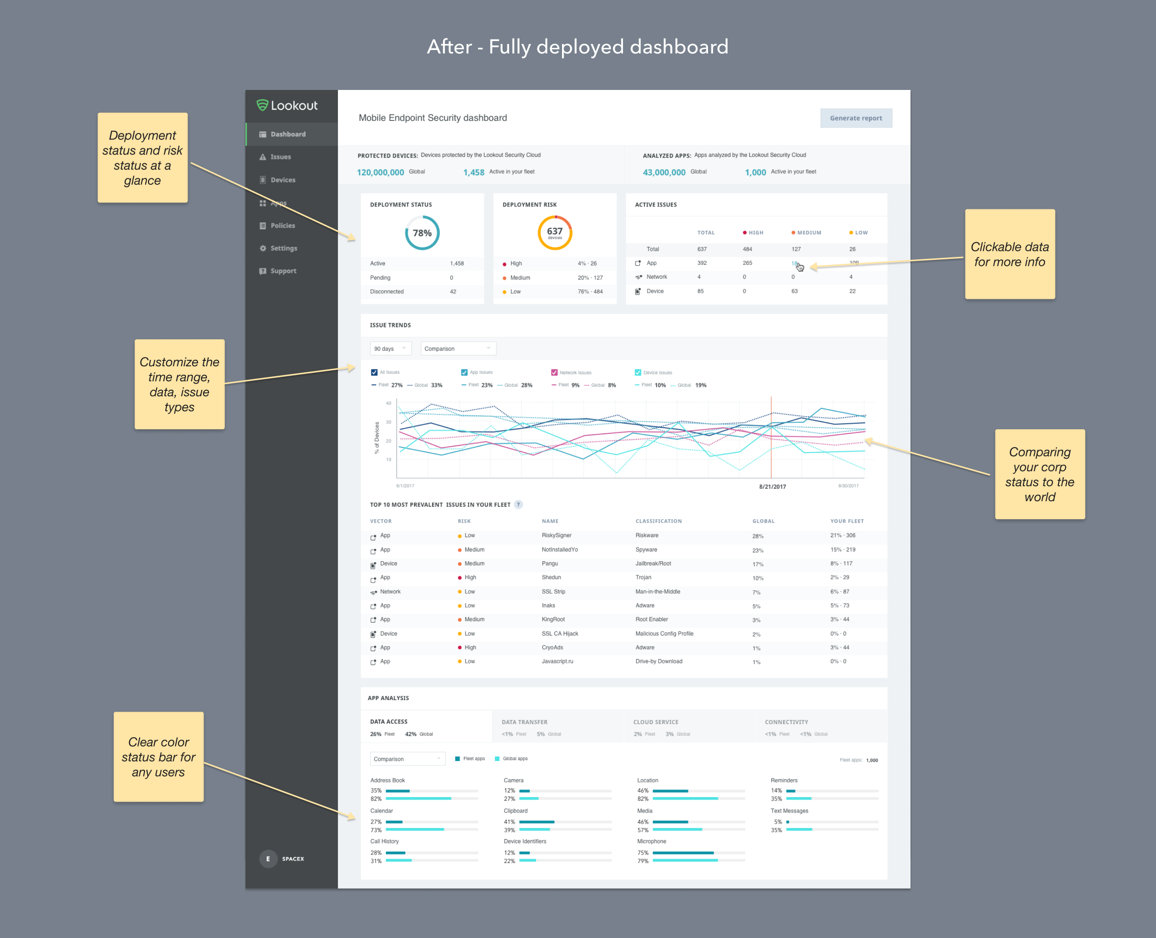
Design analysis of a dashboard – We examine what's available in the market and how they handle data presentation. As we discovered, dashboards with large amounts of data tend to look overwhelming and lack clear and concise information hierarchy. We noticed that administrators are relatively used to this amount of information. In fact, one admin said that it looks "powerful". On the other hand, inspirational data visualizations seem beautiful and intriguing, but once you dig deeper into what it means, it's not that useful. Power users are skeptical about the sources of the data and want to be able to click on the data to see more information, according to results from one of the design mockup testings. "Give context, provide channels for more information" was our design north star.

Data visualization with an inclusive approach - Often times we use the color red and green to differentiate threat from neutral data, but these colors are not suitable for colorblind users. As we documented all the data visualizations we explored along the way, we also corrected the contrast and visibilities.

High-fidelity design iterations – At the previous stage of the design, we cooperated with the data team to clarify and collect what data we know today versus what we don't know but will know later on. With all the data ingredients in hand, me and my designer partner begin exploring ways to structure the data at each phase (before, during, and after deployment). We used the maximum amount of data in a round of testing, and we let the users prioritize data usefulness and urgency. The testing result guided us to refine the information structure and consolidate the data content.
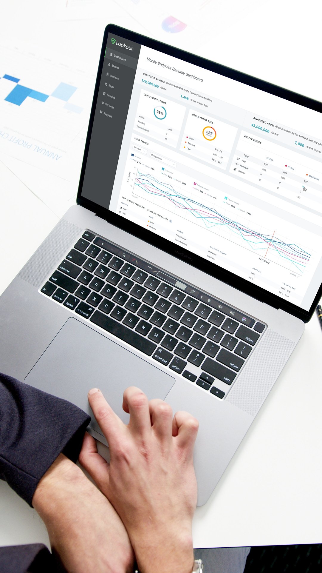
Final Design


Outcomes
THE WINS
Launched in 2020, the updated dashboard has received positive feedback. Internally, we came up with a way to track more data that was valuable and actionable for console users. Externally, users have commented on the user experience as a key difference between Lookout and its competitors. In the first 3 months, we were able to increase enrollment by 80%.
Lookout Sales team limited the number of touchpoints with customers to reduce redundant information and frustration.
THE LOSSES
The sales team did not use the dashboard in the early evaluation phase. They still used other internal reporting tools and tailored presentations. Many suggestions in the proposed product journey were not implemented due to the scope of people and lack of holistic communication.
Lessons Learned
When user testing, be comfortable with long awkward silences.
Visualizing maps may be popular and favorable, but that doesn't mean they are useful or meaningful
Data stories can only make sense when the data is clean
For two users with two different needs, one static design can never satisfy both
Though the dashboard is the first impression of the product, admins do not spend that much time on it. Instead, having an API or automated integration is preferred.